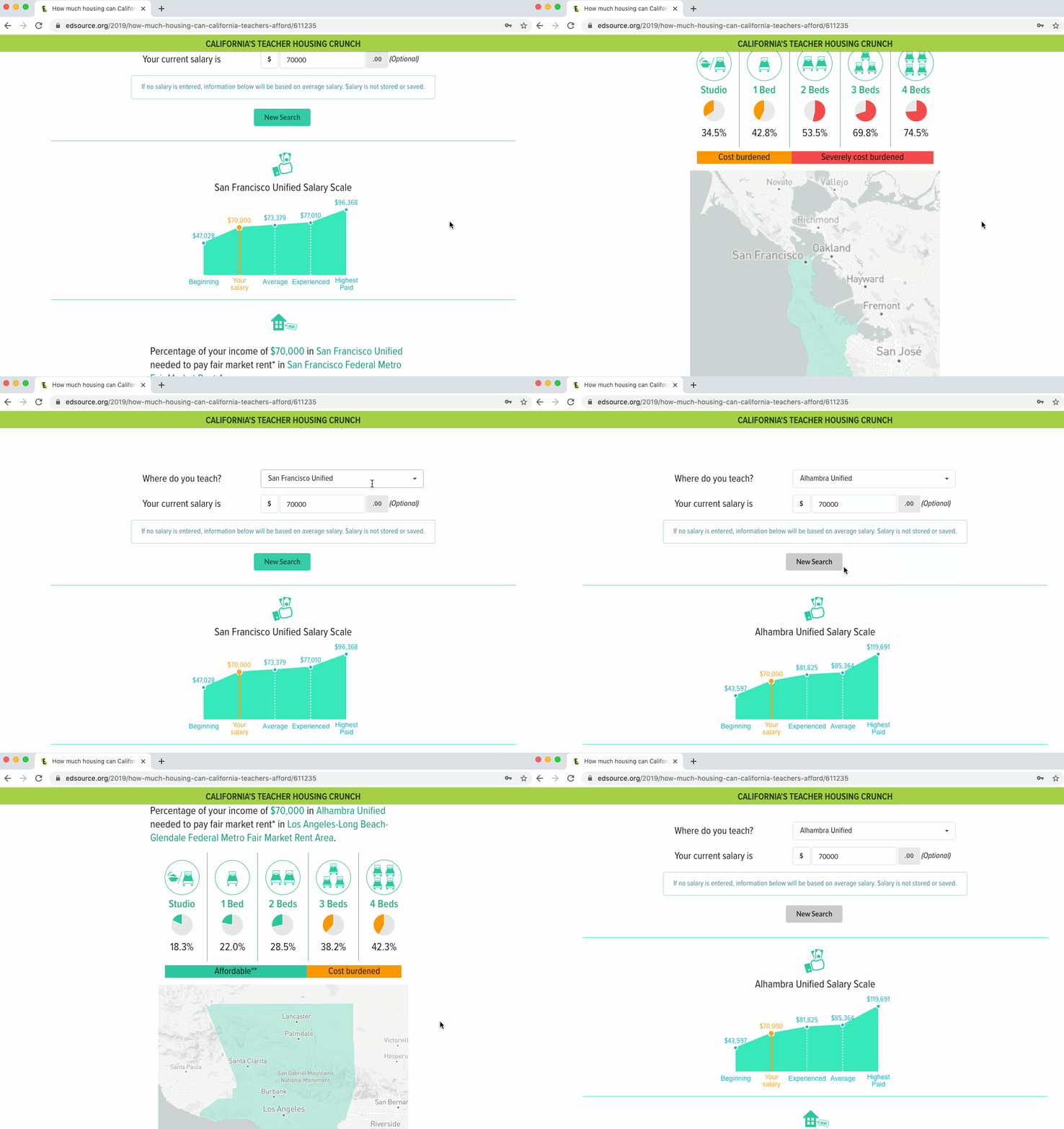
This is a teacher housing affordability app, which is a part of EdSource's Teacher housing project. Teachers can search by their districts and compare their current salary to the district's teacher salary scale. Additionally, they can see a table of affordable housing scale based on their salary.
This is my first searchable React app. My work responsibilities for this app, is to design the layout of the app, using React to build the structure of the app and use D3 pie chart library to create data visualization section. My colleague Daniel J. Willis provided me the data file and Justin Allen embedded this app as an iframe to our web server. Go to the App.
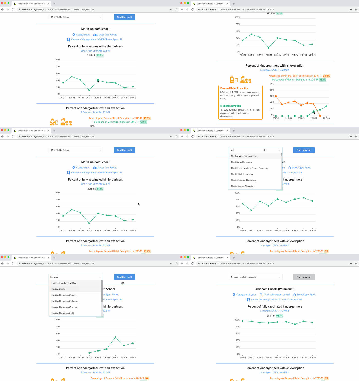
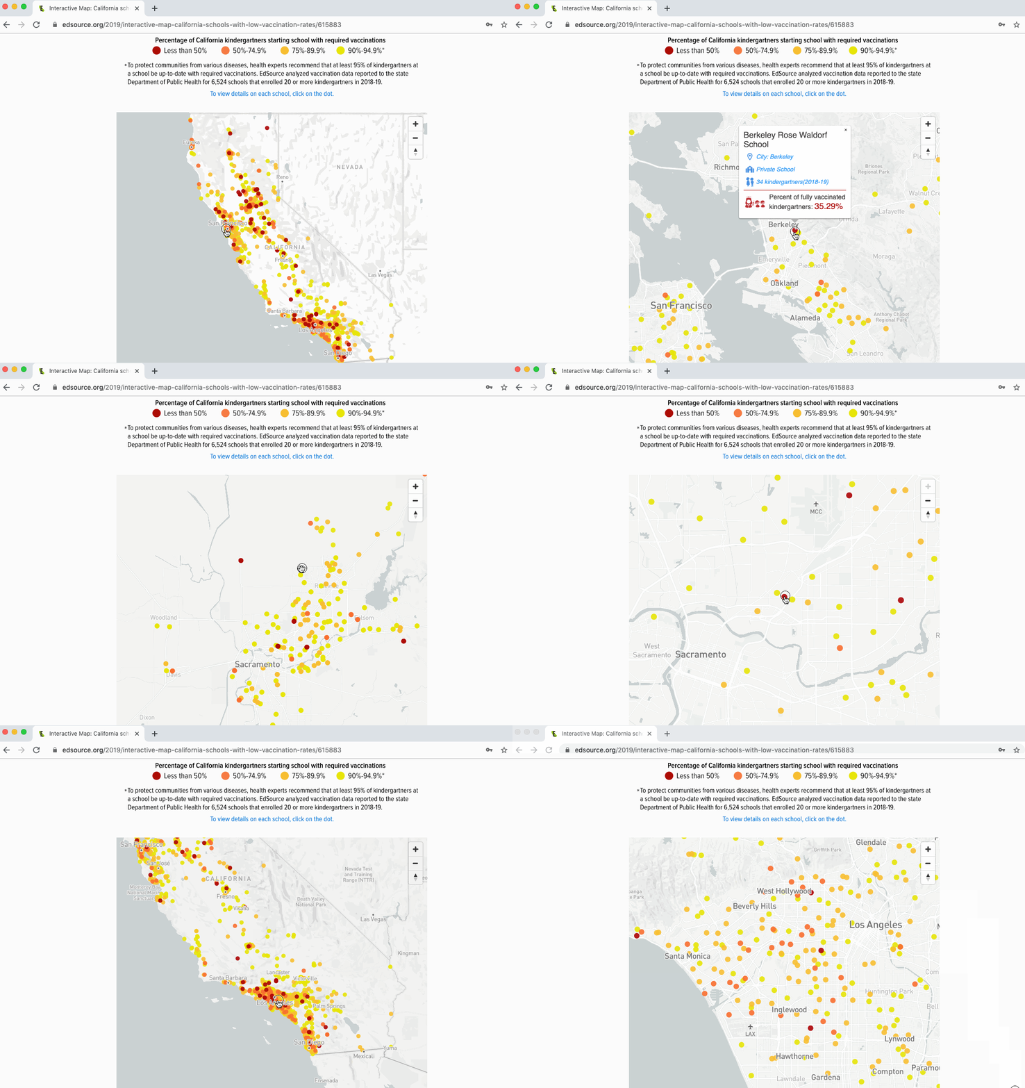
Another React tool I created for parents to search for vaccination and medical exemption rates for kindergartners at their kids’ schools in California.
My work responsibilities for this app, is to sketch the layout of the app, using React to build the structure of the app and use D3 line-chart library to create data visualization section. My colleague Daniel J. Willis provided me the data file. Go to the App.
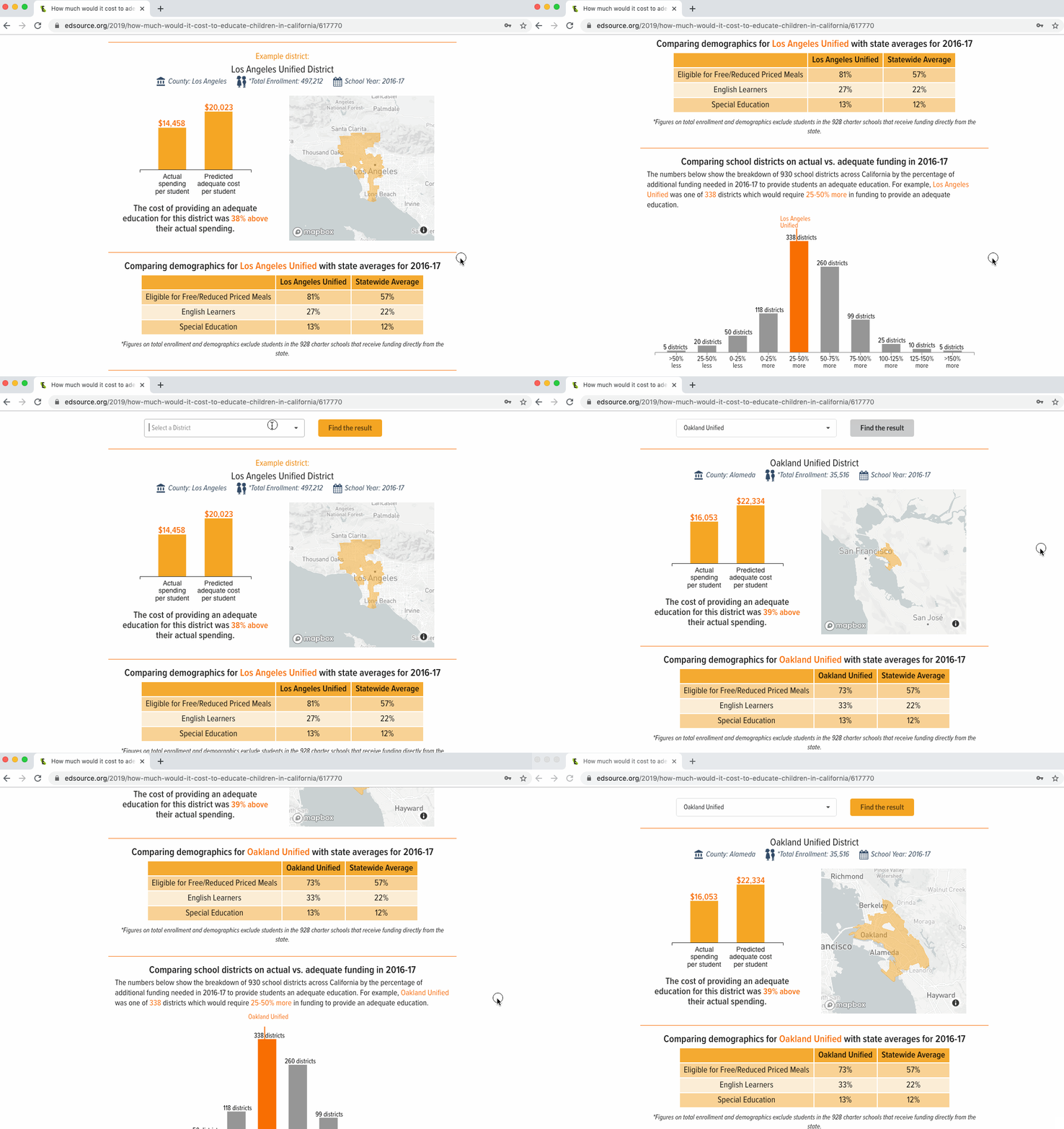
This React app is part of an ongoing series of deeper dives into the Getting Down to Facts research, in collaboration with the American Institutes for Research. I developed this tool to show the predicted adequate cost per student for each school district in California.
My work responsibilities for this app is to create the app prototype, using React to build the structure of the app, use Mapbox library to display the school district map and use D3 bar-chart library to create data visualization section. My colleague Daniel J. Willis provided me the data file and John Fensterwald wrote the introduction. Go to the App.
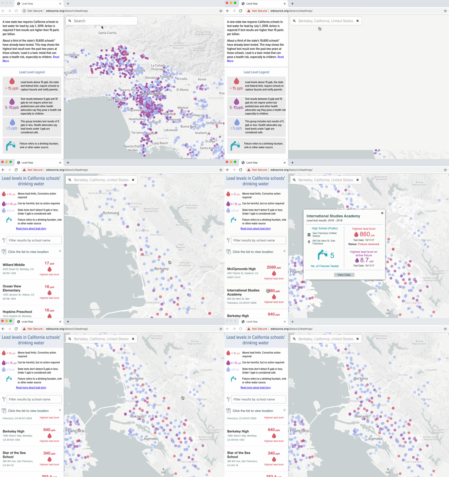
I designed and developed this searchable map for readers to browse the lead level test results in the water at more than 3,700 California schools from 2016-18. My colleague Justin Allen helped me with mobile version design and development.
This interactive map is part of EdSource’s special report project: Tainted Taps: Lead Puts California Students At Risk, which won the 2018 National Awards For Education Reporting in the category of Best Visual Storytelling from Education Writers Association(EWA). Go to the Map.
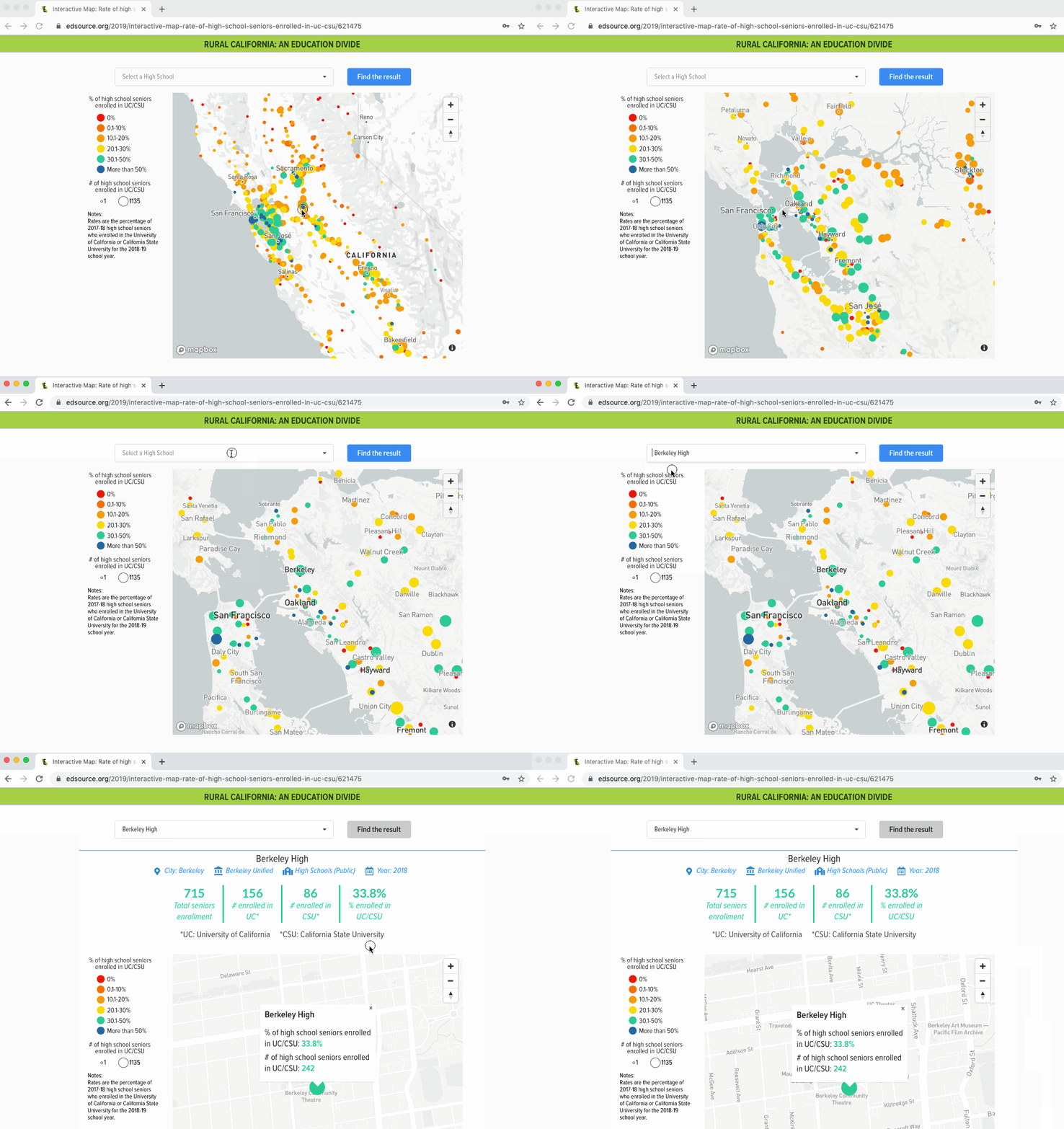
This is a React+Mapbox points map I created for EdSource’s project: Rural California: An Education divide. Readers can use this map to find out how many seniors from each California high school enrolled in fall 2018 in the University of California or California State University. It was found that one in five California high school seniors enrolled in a four-year state university. Go to the Map.
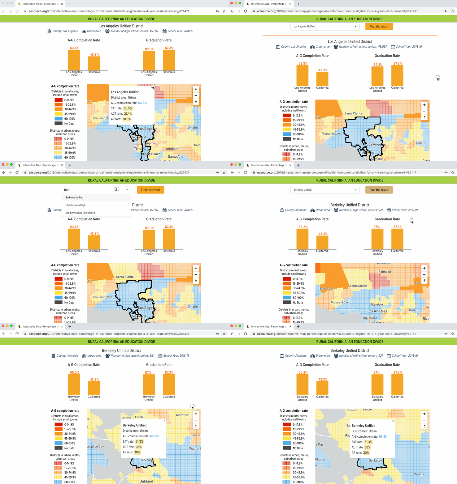
Another interesting React+Mapbox area map I developed for Rural California project. This map shows how many students in rural school districts compared to urban school districts took the courses required for admission to the University of California or California State University. It suggests that fewer students in rural school districts took the courses required for admission to the University of California or California State University. Go to the Map.
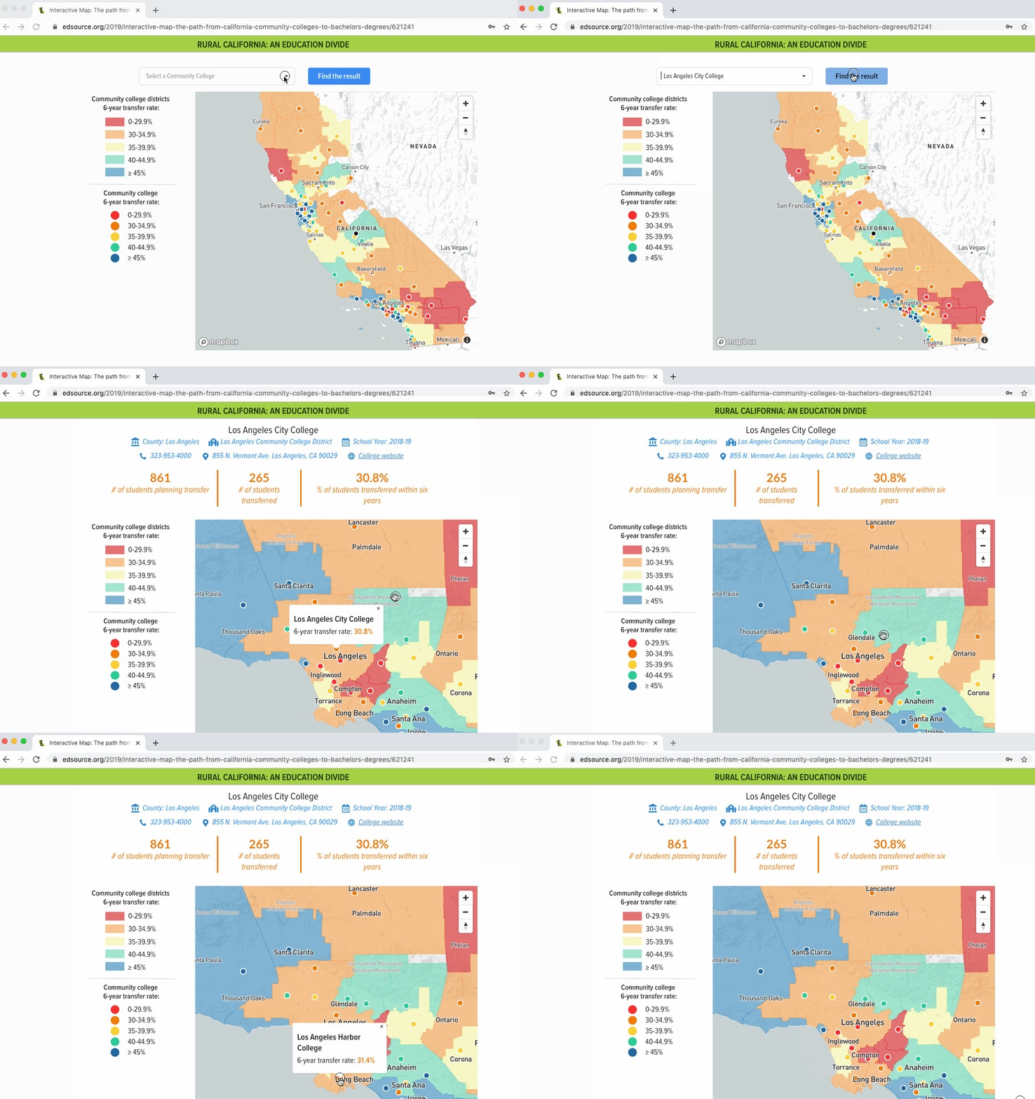
A simple but elegant React map app shows community college 6-year transfer rate in California. Each dot represents one of the state’s 114 community college campuses. And you can tell that rural community colleges have a lower transfer rate to universities within six years than colleges in other areas.For this map, I redesign the map style, create the layout and develop the map. My colleague Daniel J. Willis provided me the data file and the original map file. Go to the Map.
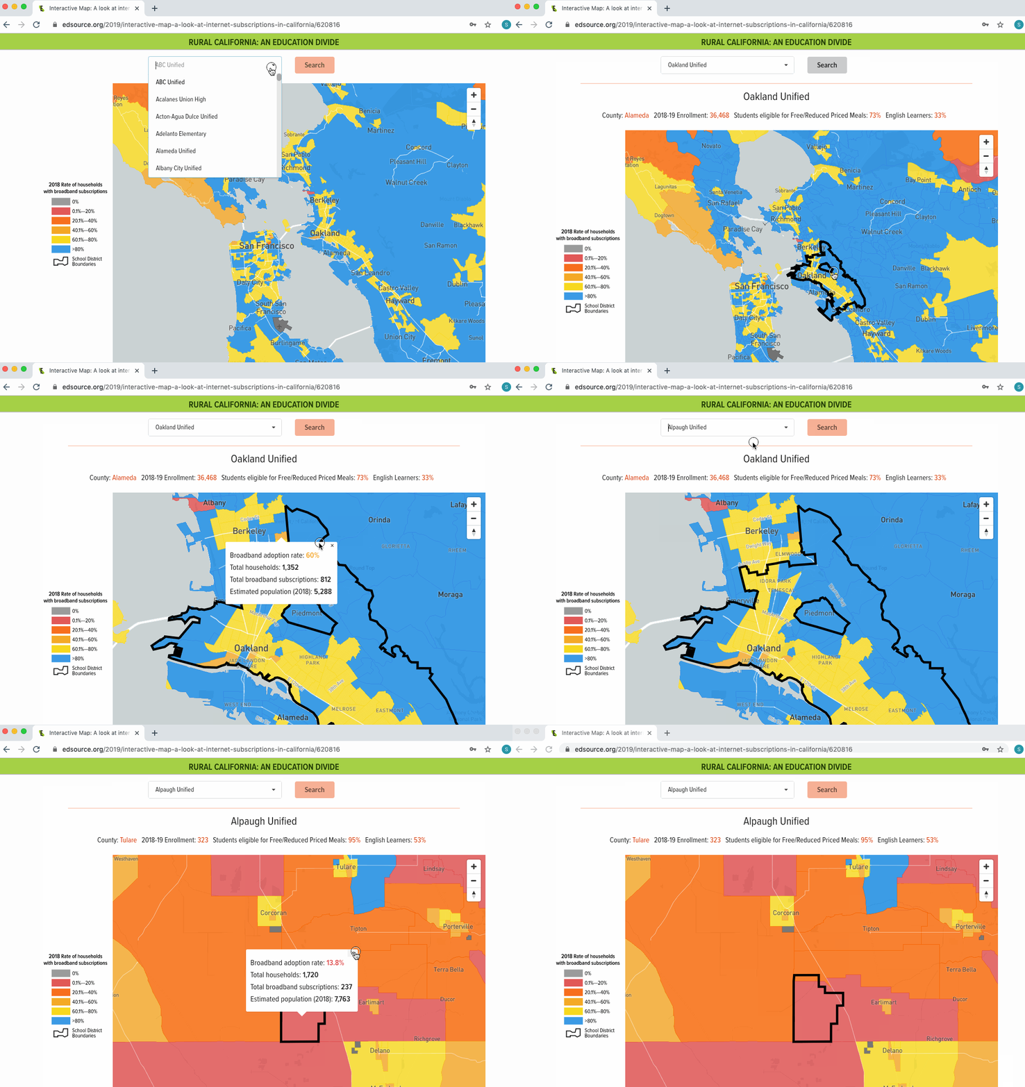
I guess I really have a passion to do React+Mapbox map. So here is another cool area map which shows the rate of internet subscriptions statewide for 2018. This is part of EdSource’s story: Disconnected: Internet stops once school ends for many rural California students. According to our analysis of data from the California Public Utilities Commission, only about a third of California households in rural areas are subscribed to internet service, compared with 78 percent in urban areas. Go to the Map.
This dot distribution map manifests California schools that enrolled 20 or more kindergartners in 2018-19 with low vaccination rates. To protect communities from various diseases, health experts recommend that at least 95% of kindergartners at a school be up-to-date with required vaccinations. Go to the Map.
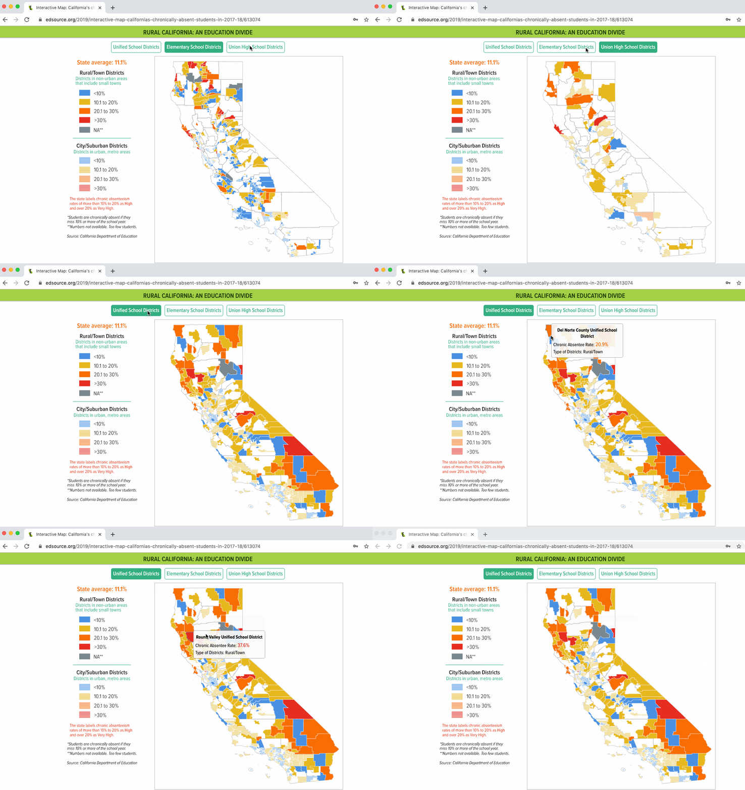
I designed and developed this map with patterns using D3 library. It shows chronic absenteeism rates by types of districts which in city/suburban or rural/town areas. The most creative part of this map is using patterns to differentiate rural areas from urban areas under the same type of school district category. Go to the Map.
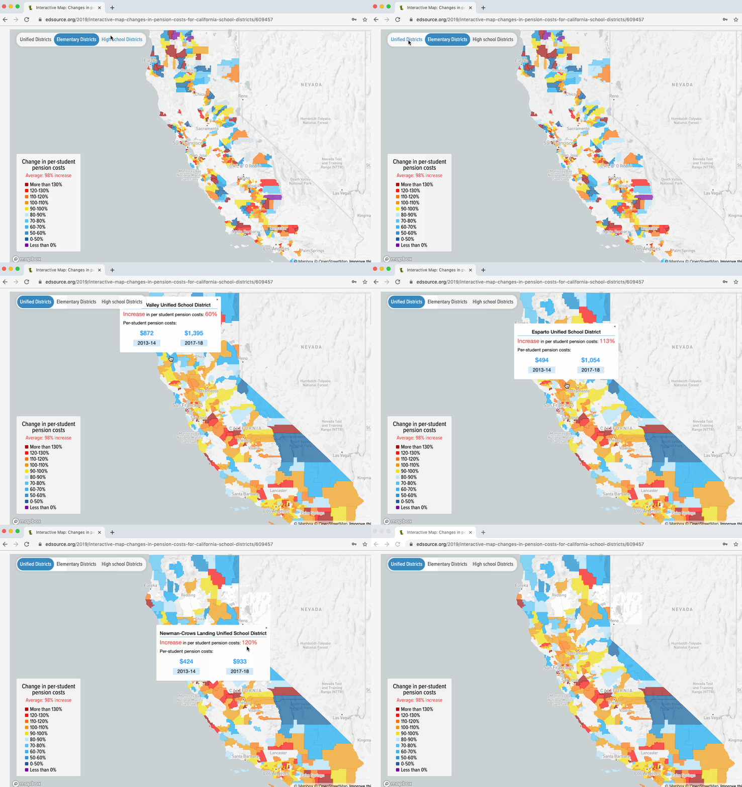
I created this map using Mapbox GL JS library. It shows the change in per-student pension costs by different school districts. Go to the Map.
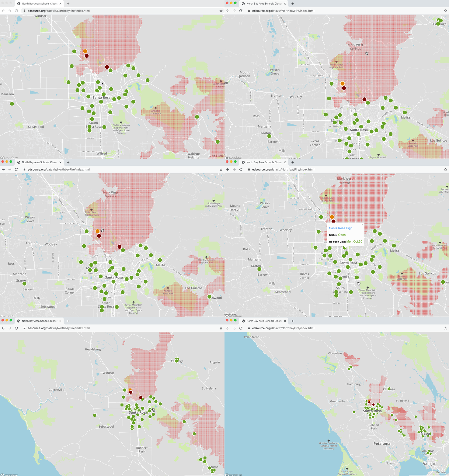
This is my first map created in the mapbox.It shows how many public schools were closed or destroyed during 2017 Tubbs Fire and how many of them re-opened after the fire was contaminated. Go to the Map.
This project combines data storytelling and interactivity to take the viewer on a journey through the growth of Chinese international travelers. The purpose of the visualization is to reveal their demographic and geographic backgrounds, as well as their favorite traveling destinations. Go to the Web.

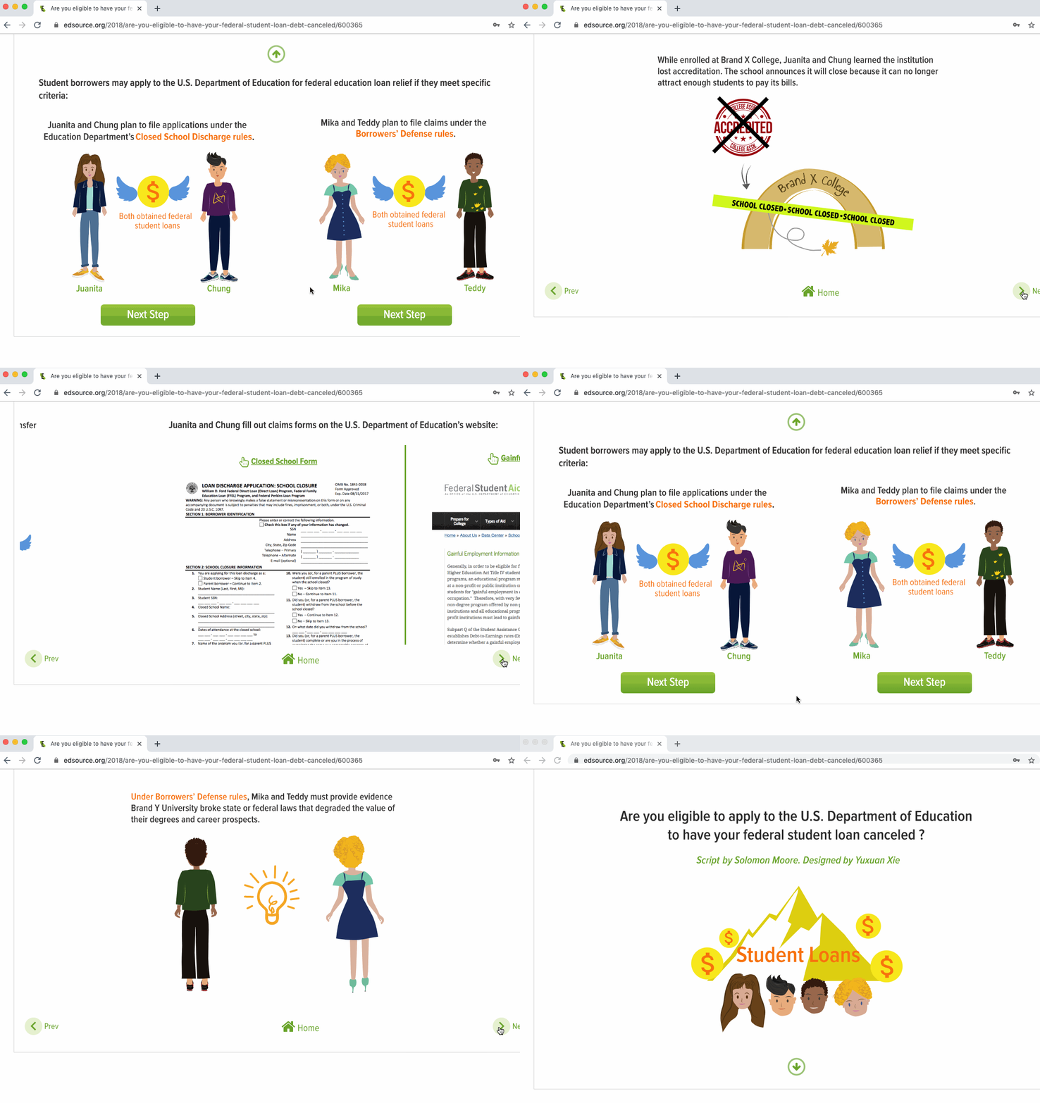
This is an interactive explainer, which illustrates two scenarios where student borrowers may apply to the U.S. Department of Education for federal education loan relief if they meet specific criteria. Go to the Web.
As another visual part of the Tainted Taps project, I created this video to explain how the practice of "flushing" water is used by school districts to protect children from lead in water - and the problems with it as a long-term solution. Watch the animation.